The website appears to be intentionally poorly designed with a jarring color scheme and chaotic layout, likely for satirical purposes.
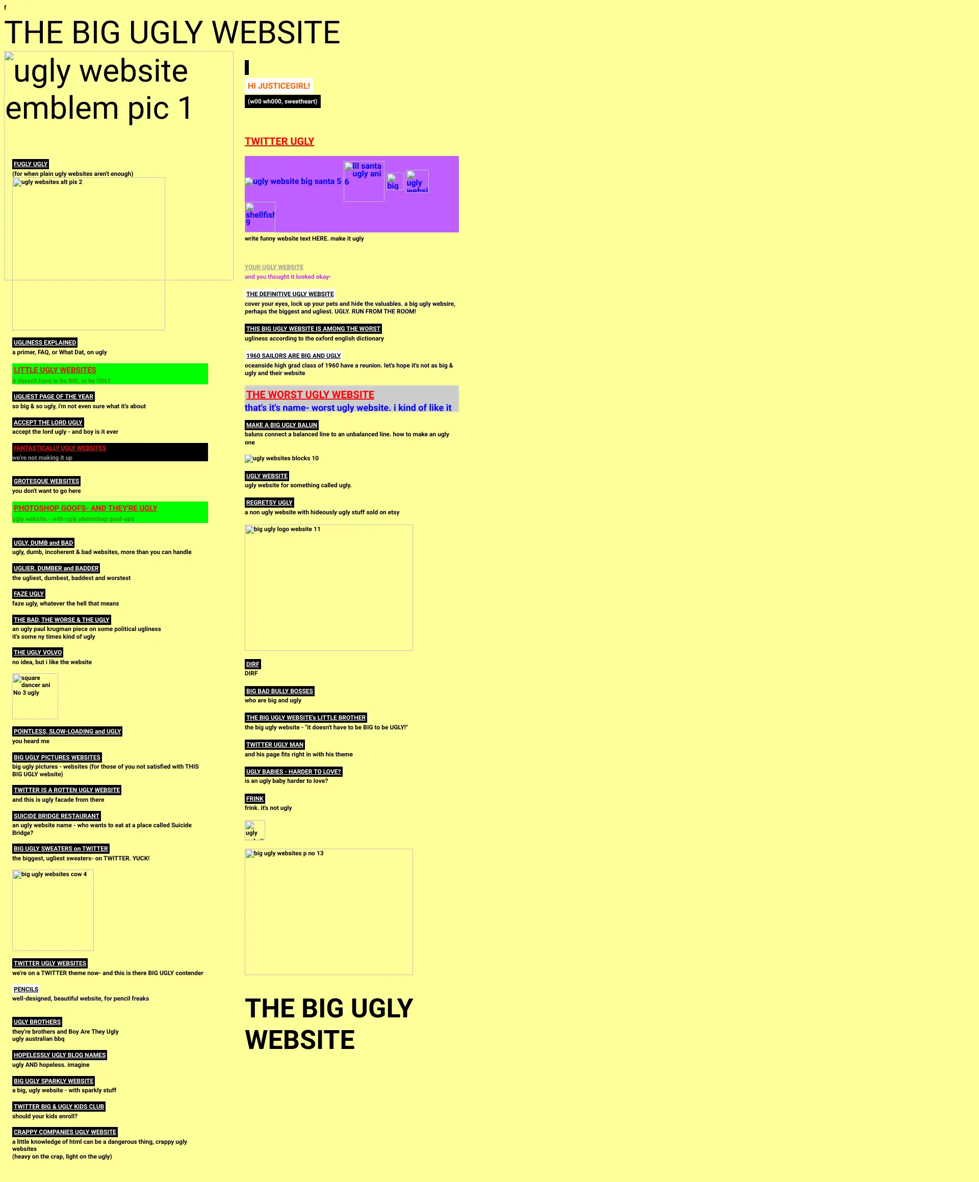
User interface

Advice: Improving the navigation menu and introducing consistency in the design could make the site more user-friendly, even if its aim is to be 'ugly.'

🧭
Navigation
The navigation menu is cluttered and lacks a clear hierarchy, making it difficult to navigate.
🎨
Consistency
The design lacks consistency with a mix of font styles and colors that do not harmonize.
📱
Responsiveness
The layout does not appear to adapt well to different screen sizes, potentially hindering the user experience on mobile devices.

User experience

Advice: Reworking the page layout to improve readability might benefit the site, while specific call-to-action buttons could engage users more effectively.

📜
Page layout
The layout hinders readability due to the chaotic alignment and contrasting colors.
🔍
Cta
Call-to-action buttons are nonexistent or not clearly identifiable, reducing user engagement.
📋
Forms
There are no visible forms to evaluate in the provided images.

Visual design

Advice: If the goal is to maintain an 'ugly' aesthetic, no changes are recommended; otherwise, a more subdued color scheme and uniform typography would improve visual design.

🌈
Color scheme
The use of bright yellow and contrasting green is visually jarring and can be straining on the eyes.
🔤
Typography
Typography is varied and often difficult to read, compromising legibility.
🖼️
Images and multimedia
The images are intentionally low-quality and contribute to the site's chaotic aesthetic.

Content

Advice: If the site's purpose is not to be intentionally 'ugly,' streamlining content and using clear headings could improve clarity and readability.

📖
Clarity
Content clarity is compromised by the chaotic design and layout.
🎯
Relevance
The content seems relevant to the site's purpose of showcasing 'ugly' websites but lacks context due to the presentation.
🔍
Readability
Headings and subheadings are inconsistent and do not contribute to the readability of the content.

Reliability

Advice: Including clear trust signals such as user reviews or endorsements could improve credibility, if the site intends to be taken seriously.

🛡️
Trustworthiness
The design does not instill trust; it lacks any conventional trust indicators.
👥
Social proof
There is no evidence of social proof elements that could affect user trust or perception.
🚪
Exit points
The overall chaotic nature of the site may prompt users to exit quickly.

Seo

Advice: Adding a clear meta description and meta keywords would improve SEO prospects.

🏷️
Meta description
The missing meta description is a lost opportunity for improving SEO.
🔍
Meta keywords
The lack of meta keywords misses another chance to enhance search engine visibility.
🌐
Url structure
The URLs are not visible in the provided screenshots, so their SEO-friendliness cannot be assessed.

Although the website seems to deliberately embrace an 'ugly' theme, there are opportunities for improved usability and SEO that would not necessarily detract from its intentional aesthetic.