The website presents a clean and modern design, clearly focusing on its offering of private video chat lessons and online course creation.

User interface
Advice: Consider incorporating a FAQ or Help section in the navigation to address common user inquiries and improve user engagement.
🧭
Navigation
The navigation menu is minimalistic and seems user-friendly, but could benefit from a clearer distinction between the options for those who want to learn and those who want to teach.
🎨
Consistency
Design elements like colors and fonts are consistent across the platform, contributing to a cohesive user interface.
📱
Responsiveness
The screenshots indicate that the website is responsively designed for both mobile and desktop devices, which is crucial for user accessibility.
User experience
Advice: No changes recommended
📄
Page layout
The layout is well-structured with a logical flow, making it easy to digest important information.
🔍
Cta
Call-to-action buttons stand out and are effectively placed to prompt user interaction.
📋
Forms
There are no visible forms in the provided screenshots, so this cannot be assessed.
Visual design
Advice: No changes recommended
🌈
Color scheme
The color scheme is harmonious and appears to be chosen to convey trust and calmness, which aligns well with an educational platform.
💤
Typography
Font choices are modern and readable, with appropriate sizing for various devices as indicated by the screenshots.
🖼️
Images and multimedia
Images used are relevant and add value to the content, demonstrating the service in action.
Content
Advice: Consider providing more detailed descriptions or examples of the types of courses and lessons that can be offered on the platform to further engage potential users.
📖
Clarity
The content is clear and concise, making it easy for users to understand what the platform offers.
🎯
Relevance
Content aligns well with the target audience of educators and learners looking for an online teaching platform.
🔍
Readability
Headings and subheadings are effectively utilized to guide the reader through the site's content.
Reliability
Advice: Adding more testimonials and incorporating trust badges (if applicable) can further enhance the site's credibility.
🛡️
Trustworthiness
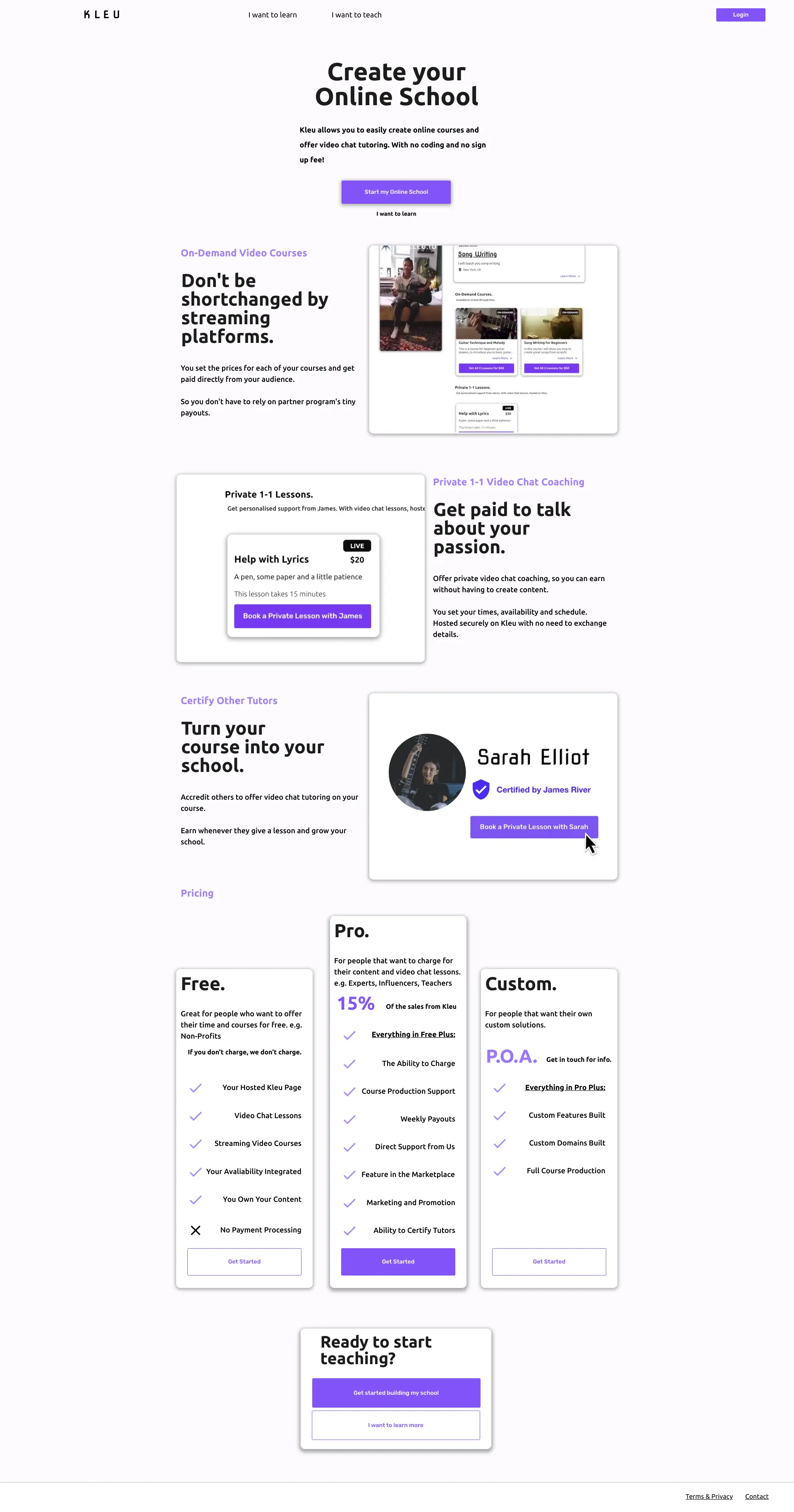
The use of a testimonial from a 'Certified by James River' instructor adds a sense of trustworthiness to the service.
👥
Social proof
The inclusion of social proof via a testimonial is a good practice, but more such elements could reinforce credibility.
🚪
Exit points
Without access to user behavior analytics, it's not possible to provide feedback on potential exit points.
Seo
Advice: Add targeted meta keywords and consider enhancing the meta description to include key features or benefits of the service.
🏛️
Meta description
The meta description is succinct and relevant, but it could be more descriptive to improve click-through rates from search engine results.
🔍
Meta keywords
The absence of meta keywords is a missed opportunity for SEO, as these can help search engines understand the content of the site.
🌐
Url structure
Without viewing the actual URLs, it's not possible to assess their SEO-friendliness or hierarchy.