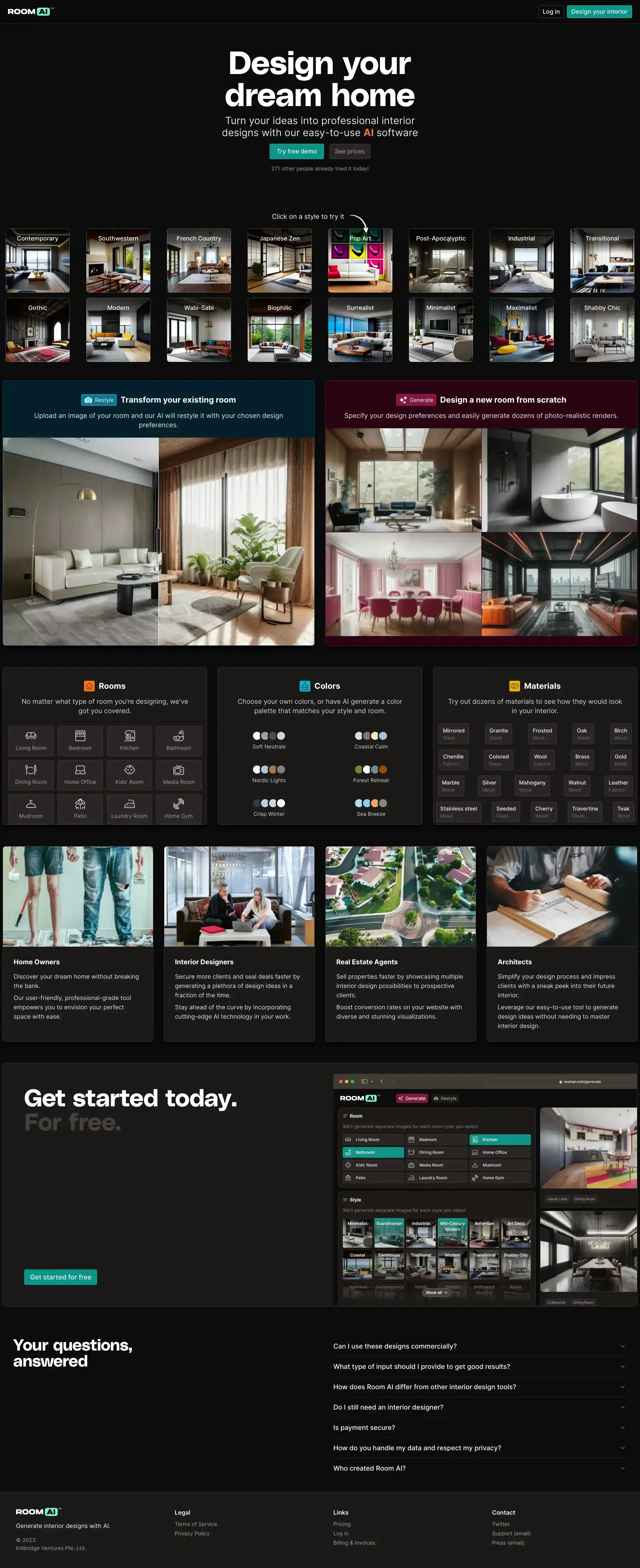
The Room AI website presents an engaging and modern interface showcasing its interior design software capabilities.


User interface
Advice: Consider adding a sticky navigation menu for ease of access as users scroll.
🧭
Navigation
The top navigation is minimal and clear, with prominent call-to-action buttons that stand out.
🎨
Consistency
Design elements such as colors, fonts, and layout appear consistent, providing a cohesive user experience.
📱
Responsiveness
The website adapts well to different screen sizes, maintaining readability and functionality.
User experience
Advice: No changes recommended.
📜
Page layout
The layout is intuitive with a strong visual hierarchy that guides the user through different sections effectively.
🔍
Cta
Call-to-action buttons are vibrant and well-placed, effectively encouraging user engagement.
📋
Forms
No forms are visible in the screenshots provided, so feedback on forms cannot be given at this time.
Visual design
Advice: No changes recommended.
🌈
Color scheme
The color scheme is modern and appealing, with high contrast that makes content easy to read.
🔤
Typography
Typography is clean and legible, with good use of different font sizes to create a visual hierarchy.
🖼️
Images and multimedia
High-quality and relevant images are utilized effectively to showcase the software's capabilities.
Content
Advice: No changes recommended.
📖
Clarity
The content is clear and concise, with easy-to-understand sections and value propositions.
🎯
Relevance
The content is well tailored to the target audience, providing relevant information for prospective users.
🔍
Readability
Headings and subheadings are effectively used to structure content, making it easily scannable.
Reliability
Advice: Integrate more trust signals such as testimonials or industry awards to enhance credibility.
🛡️
Trustworthiness
The inclusion of a testimonial and security reassurance could further enhance trustworthiness.
👥
Social proof
Social proof is not prominently featured; showcasing user reviews or endorsements could improve credibility.
🚪
Exit points
Potential exit points are not obvious from the screenshots; however, ensuring a clear call-to-action at the end of each scroll could minimize drop-offs.
Seo
Advice: Consider revising meta descriptions to use the full character limit and include meta keywords strategically.
🏷️
Meta description
The meta description is compelling and includes relevant keywords, but it could be slightly expanded for better search result displays.
🔍
Meta keywords
The absence of meta keywords is noted; while not as critical as in the past, including them could reinforce SEO efforts.
🌐
Url structure
The URL structure cannot be evaluated based on screenshots; ensure URLs are concise, descriptive, and hyphenated if necessary.