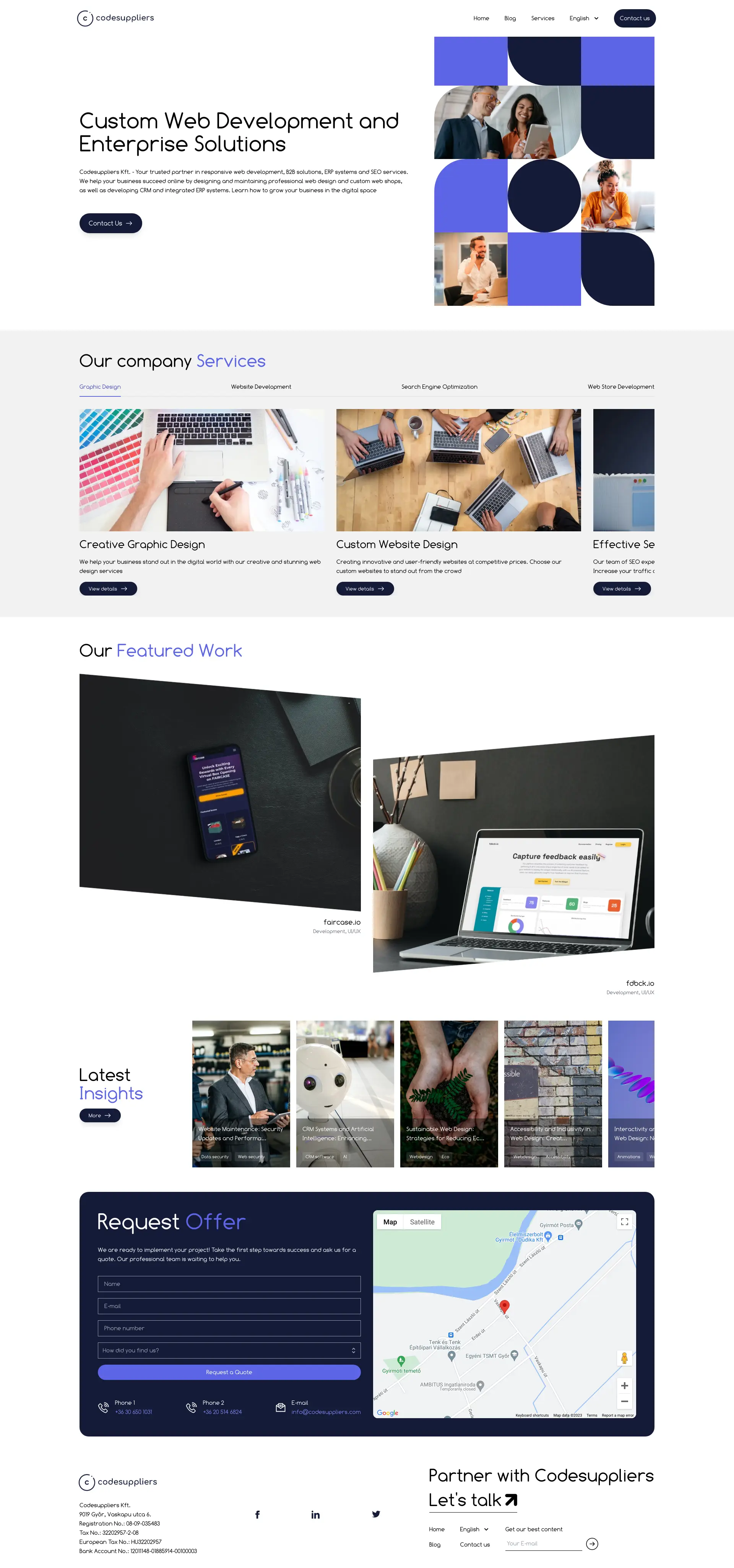
The website presents a clean, professional appearance with a strong visual hierarchy that makes it easy to navigate.


User interface
Advice: Ensure that responsive design is consistently maintained by periodically testing on new devices and browsers.
🧭
Navigation
Navigation appears straightforward and categories are clearly defined, facilitating a user-friendly experience.
🎨
Consistency
The design maintains strong consistency with cohesive use of colors and typography, which enhances brand recognition.
📱
Responsiveness
Screenshots indicate a responsive design that adapts well across devices; however, live testing on various screen sizes would be essential for confirmation.
User experience
Advice: Test forms for ease of use and ensure error messages guide users effectively towards successful form completion.
📜
Page layout
The page layout presents information in a readable and logical flow, with key services and calls-to-action displayed prominently.
🔍
Cta
Call-to-action buttons stand out and are well-placed to attract user interaction, aligning with the site's conversion goals.
📋
Forms
The 'Request Offer' form appears simple and user-friendly; however, without interacting with it, it's difficult to assess error handling.
Visual design
Advice: No changes recommended
🌈
Color scheme
The color scheme is harmonious and maintains good contrast, enhancing readability and likely having a positive psychological impact.
🔤
Typography
Font choices and sizing seem appropriate for readability across devices, contributing to a pleasant visual experience.
🖼️
Images and multimedia
Images and multimedia elements used are high-quality and relevant, successfully enhancing the site's design and messaging.
Content
Advice: No changes recommended
📖
Clarity
Content appears to be clear and concise, conveying the company’s services effectively without overwhelming visitors.
🎯
Relevance
The content seems well-aligned with the website’s purpose and its intended B2B audience, focusing on professional web development services.
🔍
Readability
Headings and subheadings are used effectively to structure content and guide users through the site, improving readability.
Reliability
Advice: Consider adding a section with client testimonials, case studies, or industry awards to enhance trust and encourage conversions.
🛡️
Trustworthiness
The website's design and clearly labeled contact information increase trustworthiness; nevertheless, including testimonials or client logos could further enhance credibility.
👥
Social proof
Social proof is not prominently featured in the provided screenshots; incorporating such elements could significantly bolster the site's persuasiveness.
🚪
Exit points
Insufficient data to ascertain exit points; however, analytics and user behavior tracking could reveal areas for improvement.
Seo
Advice: Clean up the meta keywords to avoid redundancy and ensure each is unique and relevant to the site's content.
🏷️
Meta description
Meta description provided seems thorough and relevant, containing key terms that likely match the target audience's search intentions.
🔍
Meta keywords
Meta keywords are repetitive; it's advisable to refine them to a more targeted list that reflects the various services offered.
🌐
Url structure
Without seeing the full URL structure, it's difficult to assess. However, ensure URL paths are concise and reflect the page's content.